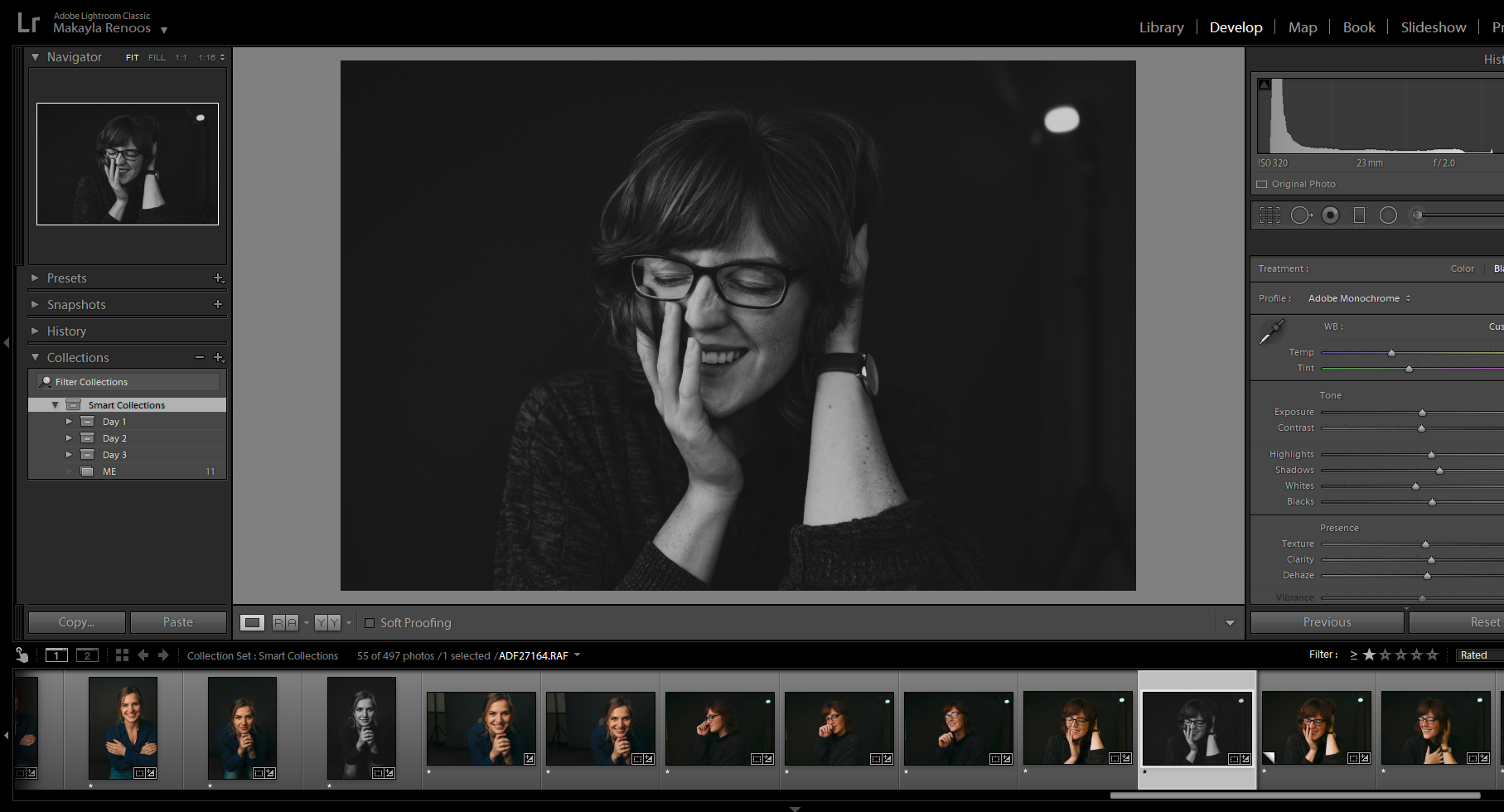
In order for each photographer to achieve their desired look, there’s a lot of settings and sliders to sort through to find our favorites. The following breakdown explains my three favorite Lightroom sliders and how I implement them. By using these sliders, I create a look of rich color and natural contrast in my images.
Dehaze Slider
In my editing, I do my best to have impactful rich coloring and true-to-life contrast and appearance. Because of the contrast and coloring I use, the dehaze slider tends to be one of my go-to’s to adjust contrast.
Dehazing is great for when you have backlight that washed out an image or something of a similar nature. Most of the time however, I use it to remove contrast and saturation, so I can more fine tune afterwards. I then adjust contrast and saturation using the shadows, blacks, and HSL sliders. Having the ability to more directly fine tune the saturation and contrast gives me a natural look rather than contrasted look. Especially on images where my contrast is already as low as the regular contrast slider goes, the dehaze tool allows me to bring it just a little further back. I can then paint it back in where I want it.
Clarity Slider
The clarity slider adjust the definition in the midtones of an image, specifically along lines where the shift from light to dark is most noticeable. The clarity slider goes from -100 to 100 (at the time of this post) with zero being the default middle value of the image as-is. Clarity can help increase overall sharpness, and moving the slider up is especially useful for landscape images, where definition and detail improves the image overall.
For weddings, I often set the clarity slider somewhere around -10. My reason for bringing clarity down has a lot of do with Fuji files – naturally, the RAF files are incredibly sharp and detailed, a product of the technical aspects of mirrorless cameras, and being an APS-C sensor. The clarity slider played the largest role in having the Fuji files mimic those of Canon files, when I was still using both systems at once.
Full-frame DSLR cameras have a more defined and more narrow depth of field than APS-C and mirrorless cameras, so the clarity helped to mimic those settings and create an overall conformity. Now, in just Fuji files alone, I use them to create a softer, more natural looking contrast as opposed to a more stark, defined version (which in beautiful and necessary in some situations, but not always on human faces.
HSL Panel
The HSL Panel (Hue, Saturation, Luminance) is what I would say typically defines the editing style of a photographer (in combination with split toning). The way you use color to tell a story is highly indicative of what you find to be important. Like mentioned above for the dehaze slider, my goal is to have real, rich colors with natural contrast. Once I use the dehaze/contrast sliders to remove much of the saturation and contrast, I’ll paint it back in using the HSL sliders.
The HSL panel is divided into three adjustments: hue, saturation, and luminance. Hue adjusts the tonality of individual colors (such as taking red towards purple-red versus orange-red). Saturation affects the intensity of the color. Luminance affects the lightness and darkness of a color. Each of these can be adjusted for every color on the spectrum, giving you complete control over the color and tonality impression in your image.
This panel is great for correcting colors that were affected by their environment (for example, greens that look neon in the midday sun but not in real life) but also for adding richness using the saturation and luminance sliders.

Be the first to comment